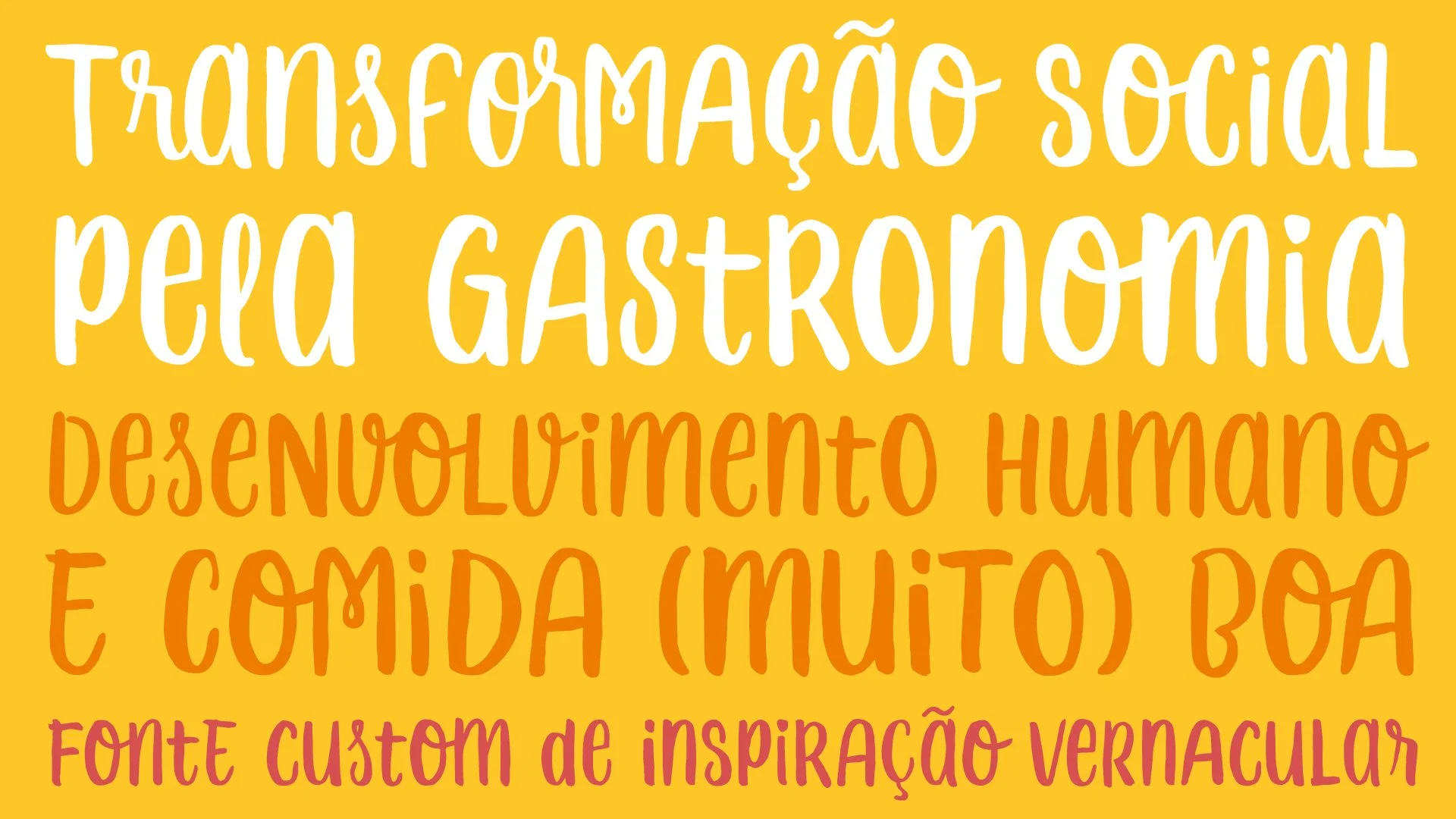
Human development & nice food.
The “Chef Aprendiz” (“Apprentice Chef”) is a human development non-governmental project that uses gastronomy as the main tool for empowering young people from 16 to 20 years old in socially vulnerable situations to work in partner restaurant’s kitchens as their first job.
With the growing of the project, a new visual identity was designed to communicate with three main publics: potential investors, media to publicize the work and the young people in the communities that may be interested in getting involved.
In this context, an exclusive custom font seeks to show a careful visual identity, its roots in the brazilian popular visual universe, stand out from other projects, and clearly and sympathetically communicate the personality of the brand and its social work.
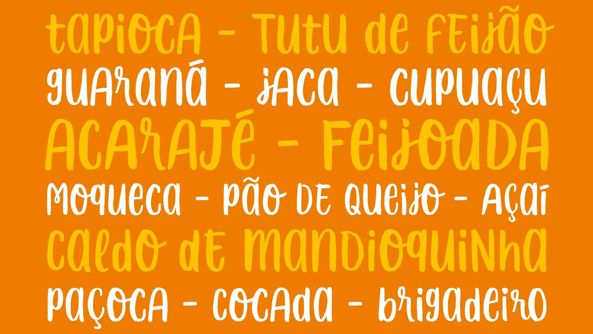
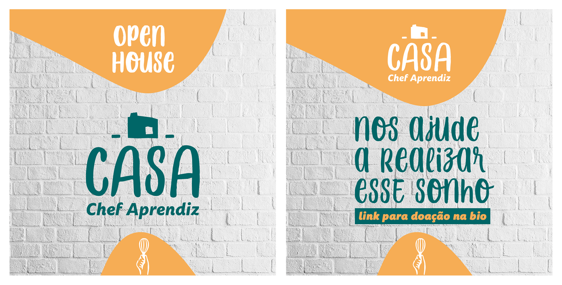
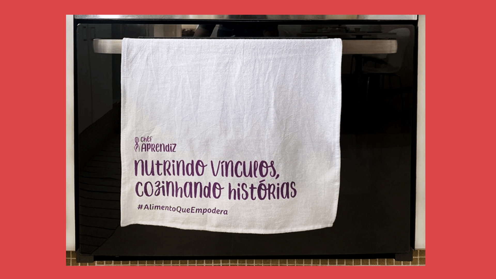
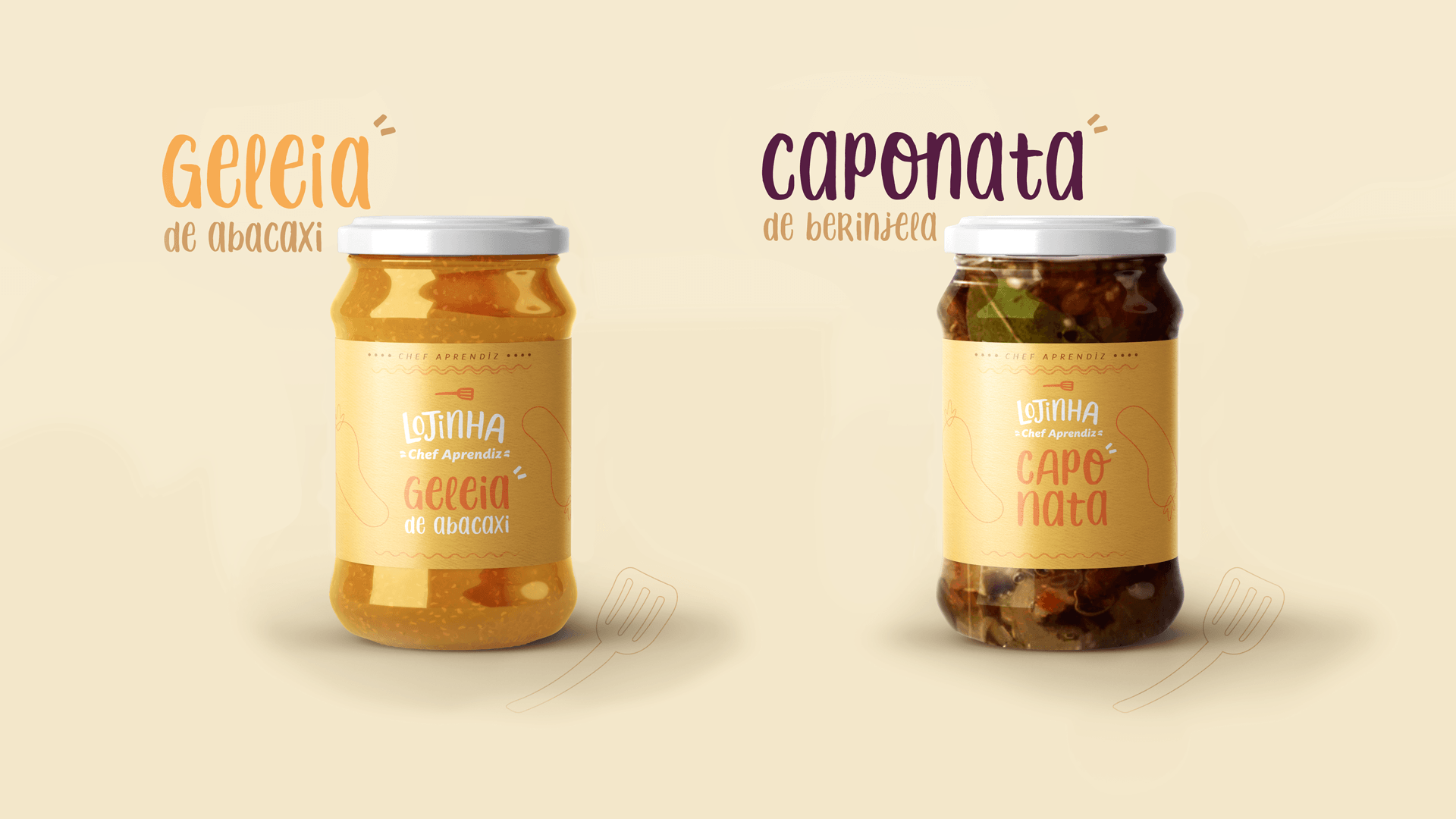
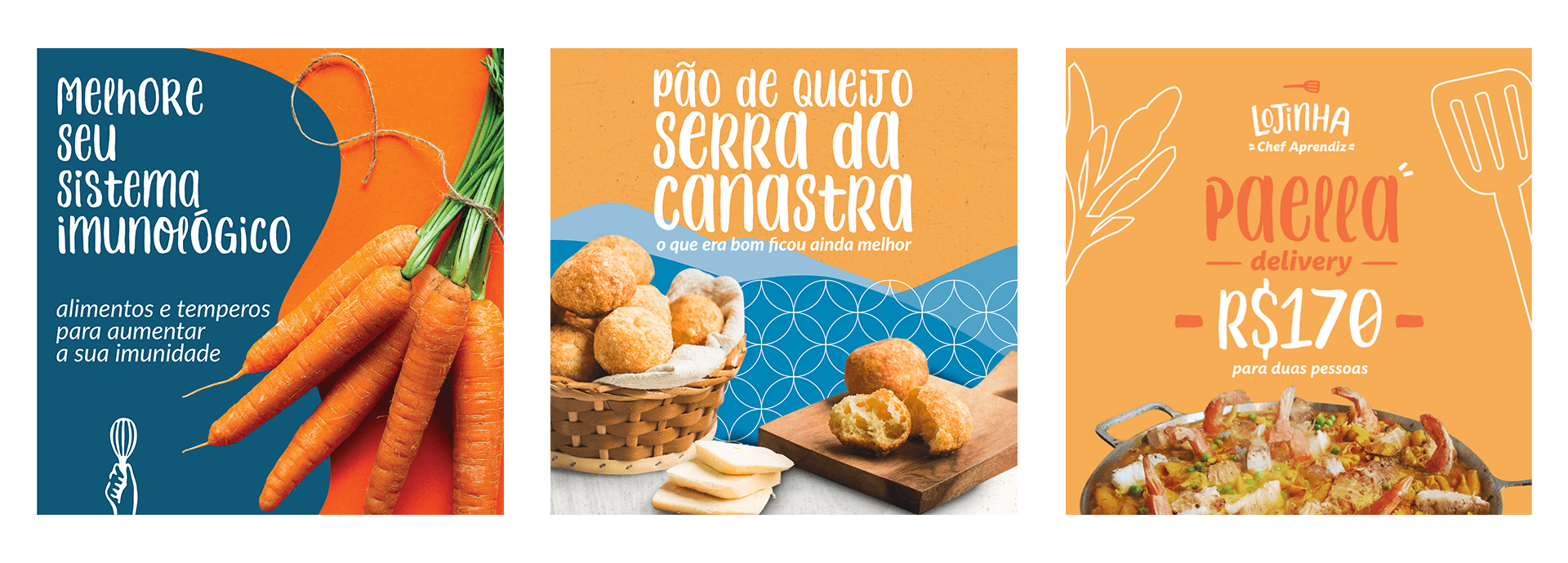
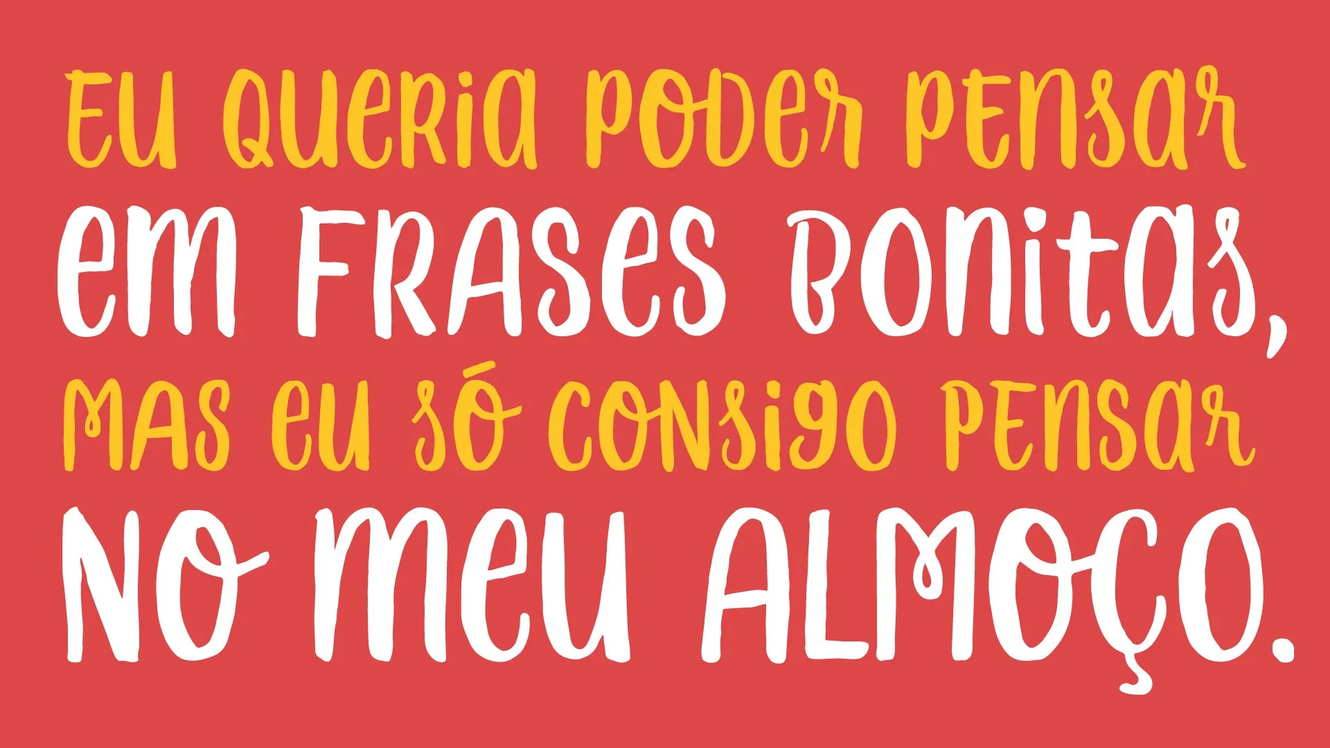
The “Chef Aprendiz” font has vernacular inspiration, in handwriten letterings used for wayfinding and menu in popular Brazilian restaurants and bars.
__
*The project was selected for a shortlist of about 500 design works, and 32 type design related, for the 13ª Graphic Design Biennial in Brazil.
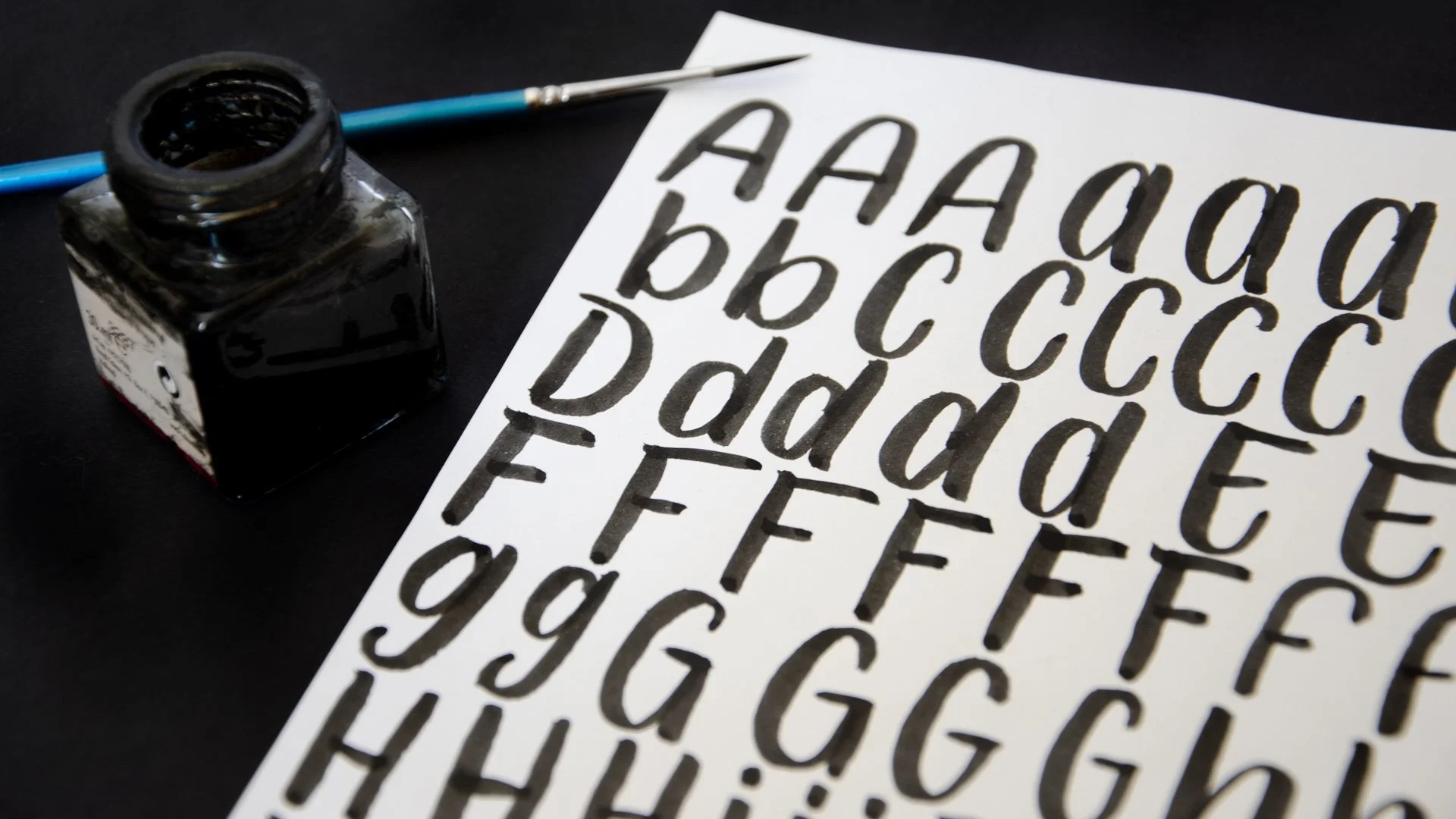
From ink to vector.
In order to make the font more interesting under the perspective of vernacular aesthetic, in other words the handmade look with trace variations, the glyphs were first drawn with ink and brush, and then scanned and vectorized.
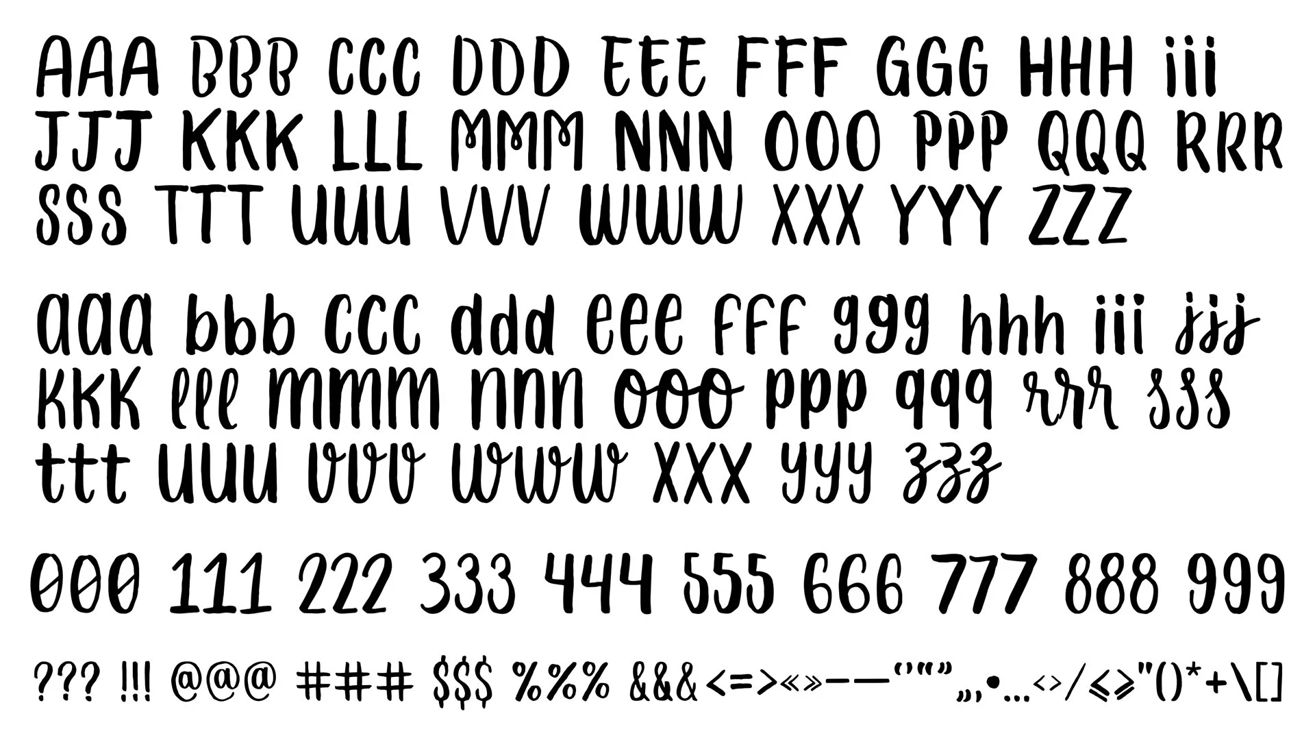
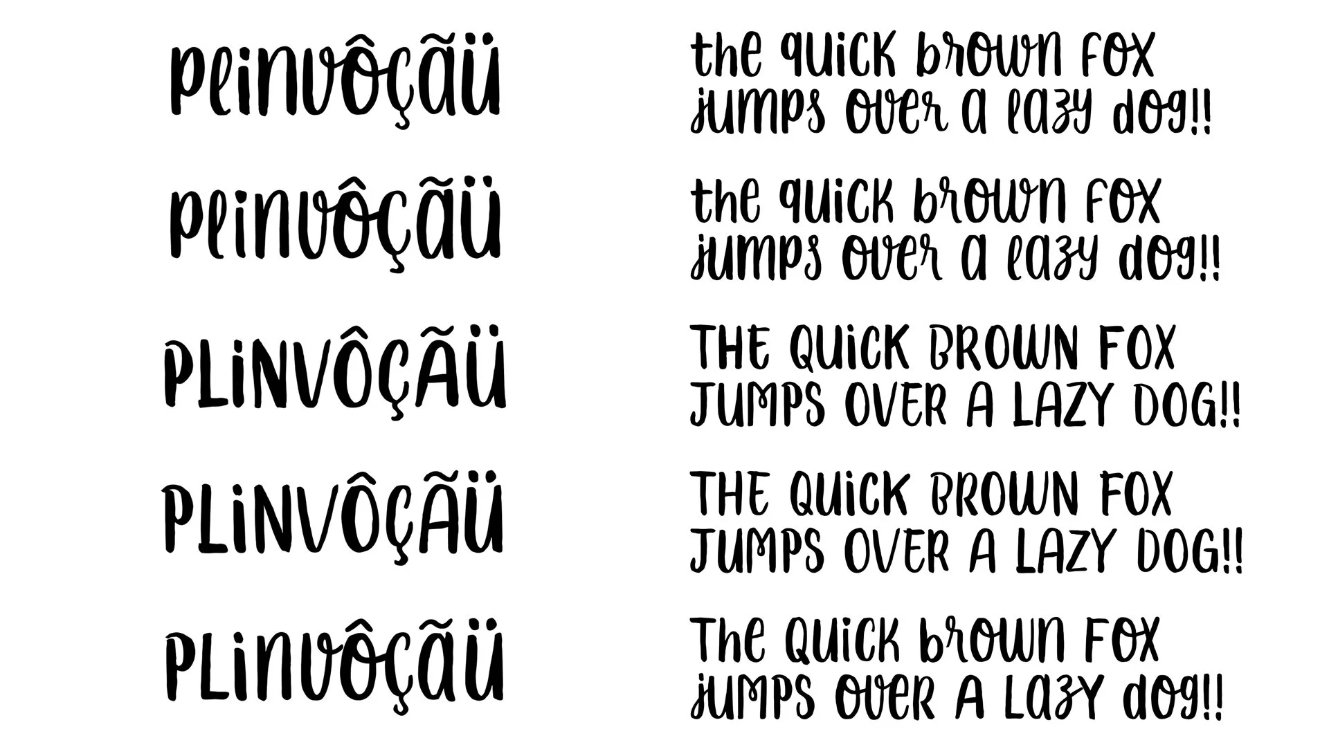
Unicase font, with alternates.
The typeface design is some kind of unicase where every letter has the same height, and it allows mixing upper and lower case in the same text to vary letterforms. The character set includes upper case, lower case, a set of numbers, fractions, punctuation, symbols, and some contextual ligatures to substitute conflicting sequencies of letters.
Besides, every glyph has three slightly different versions that are randomized with an OpenType feature as we type – this way we avoid the sensation of artificiality in the group of letters of a title or sentence.