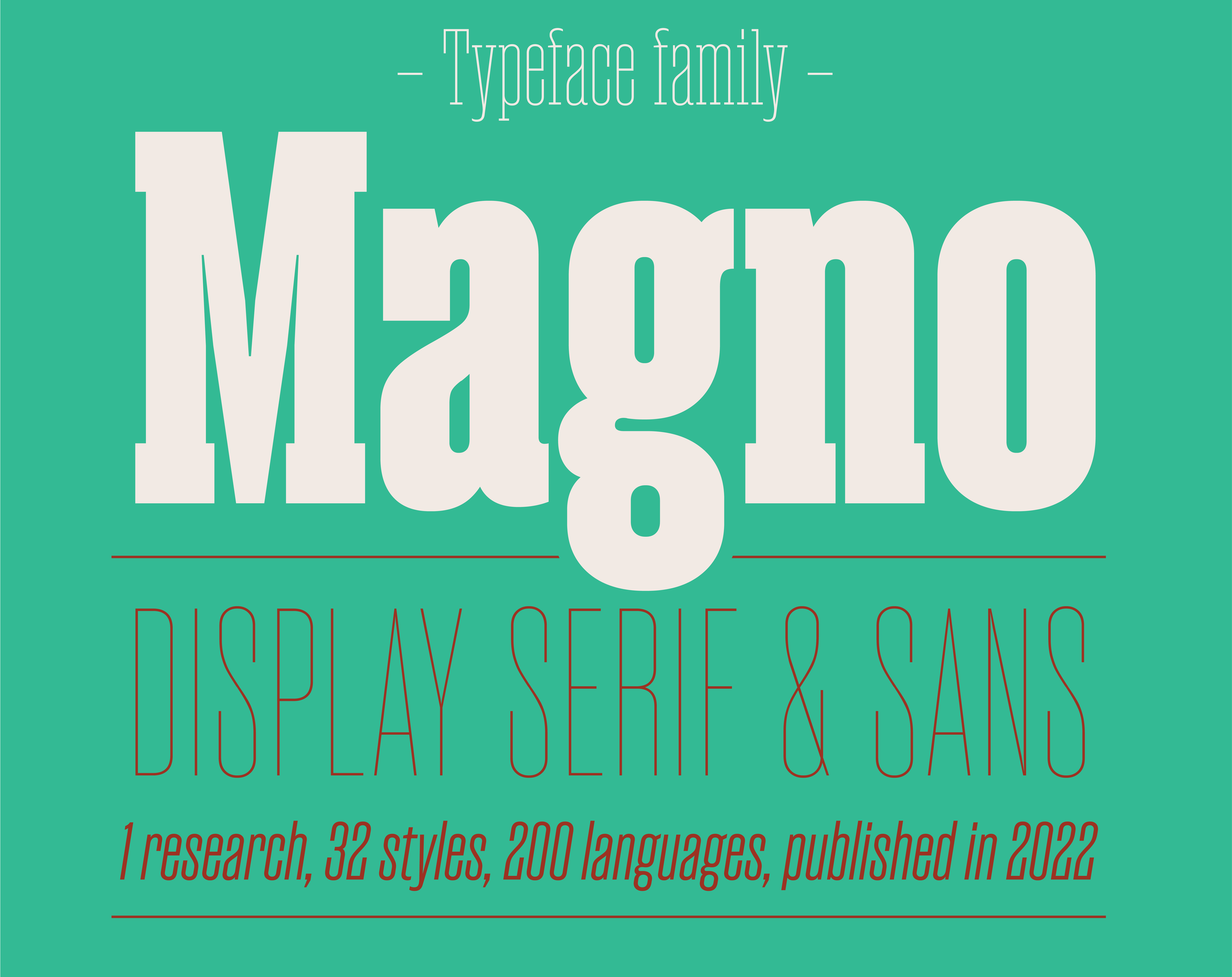
A font family that started out as a revival of an unidentified cast type, but eventually, and after a deep research, ended up with it’s own design and features.
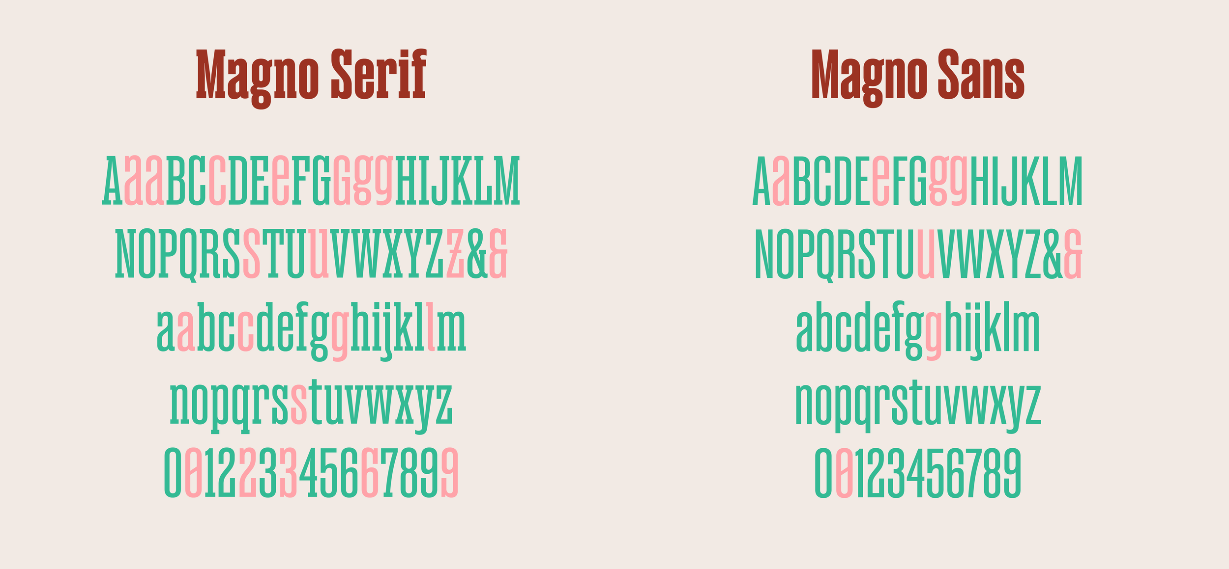
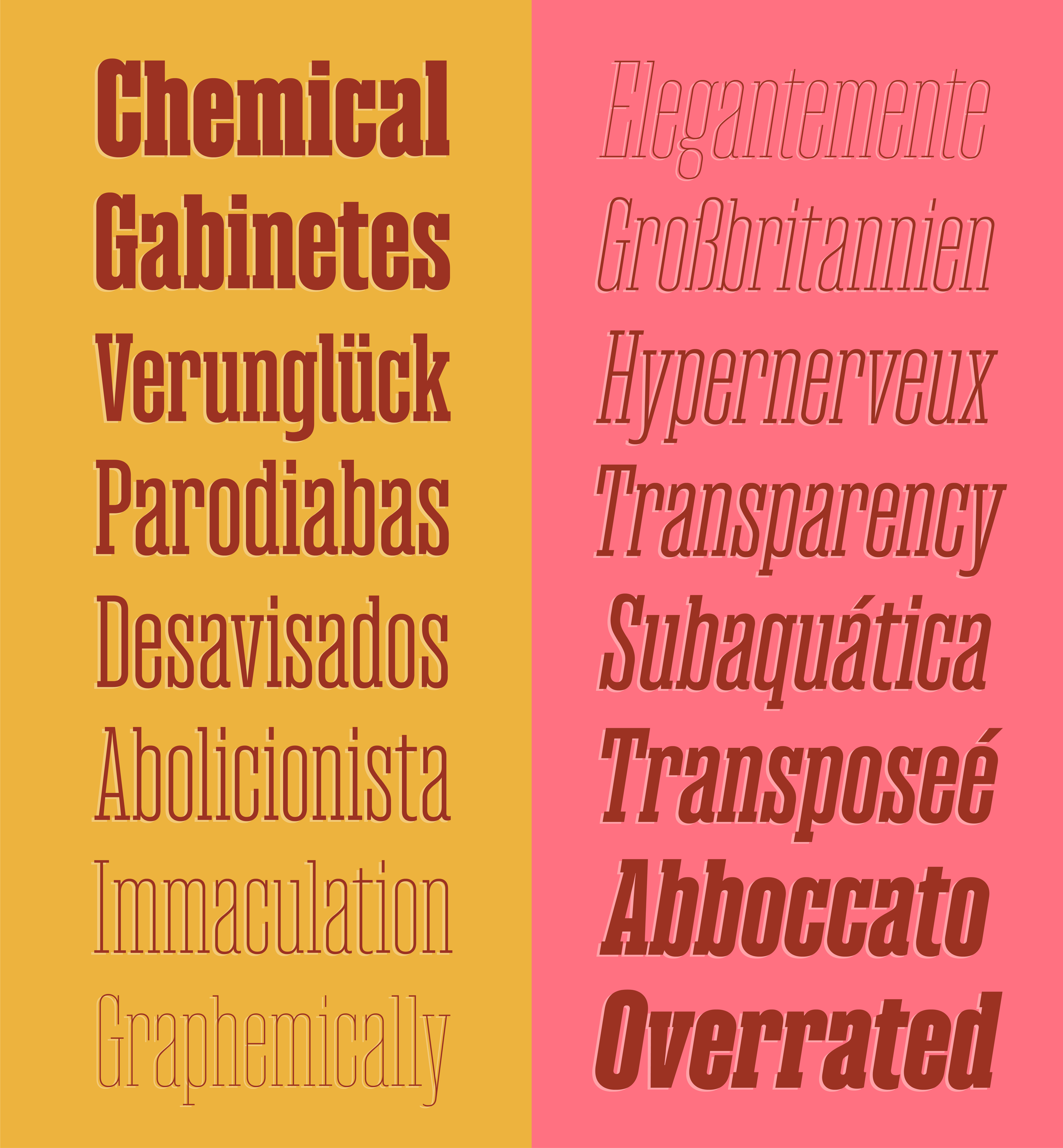
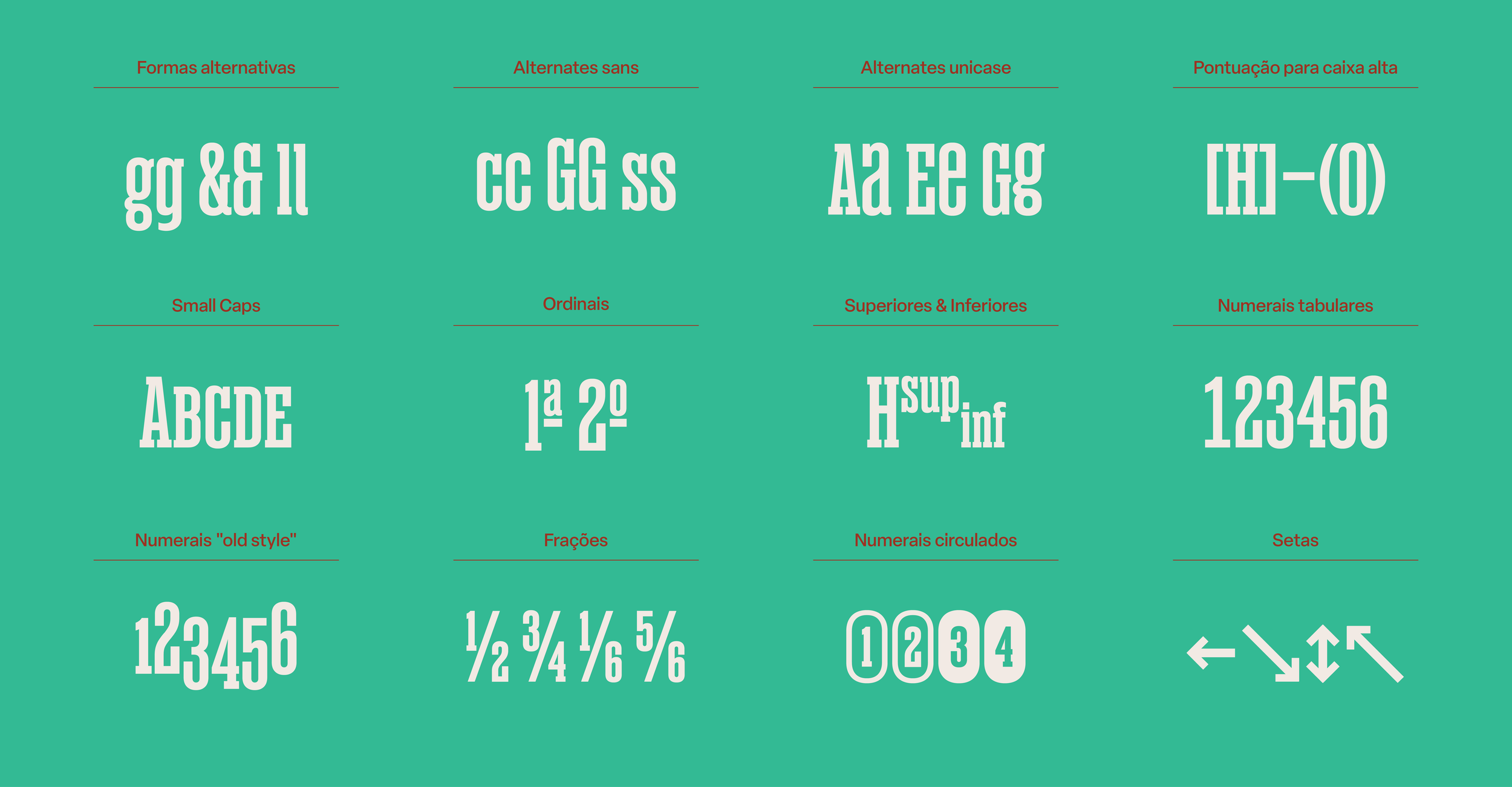
Magno has 1171 glyphs in Serif and 996 in Sans, and a considerable amount of OpenType Features: old style numbers, tabular and circled figures (positive and negative), fractions, currency symbols, small caps, superiors and inferiors, arrows and alternates.
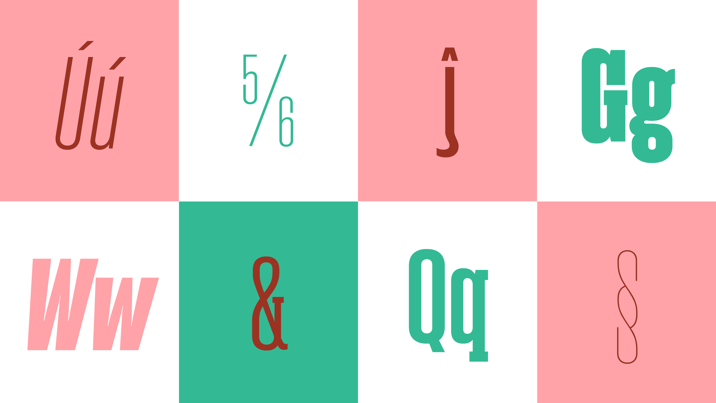
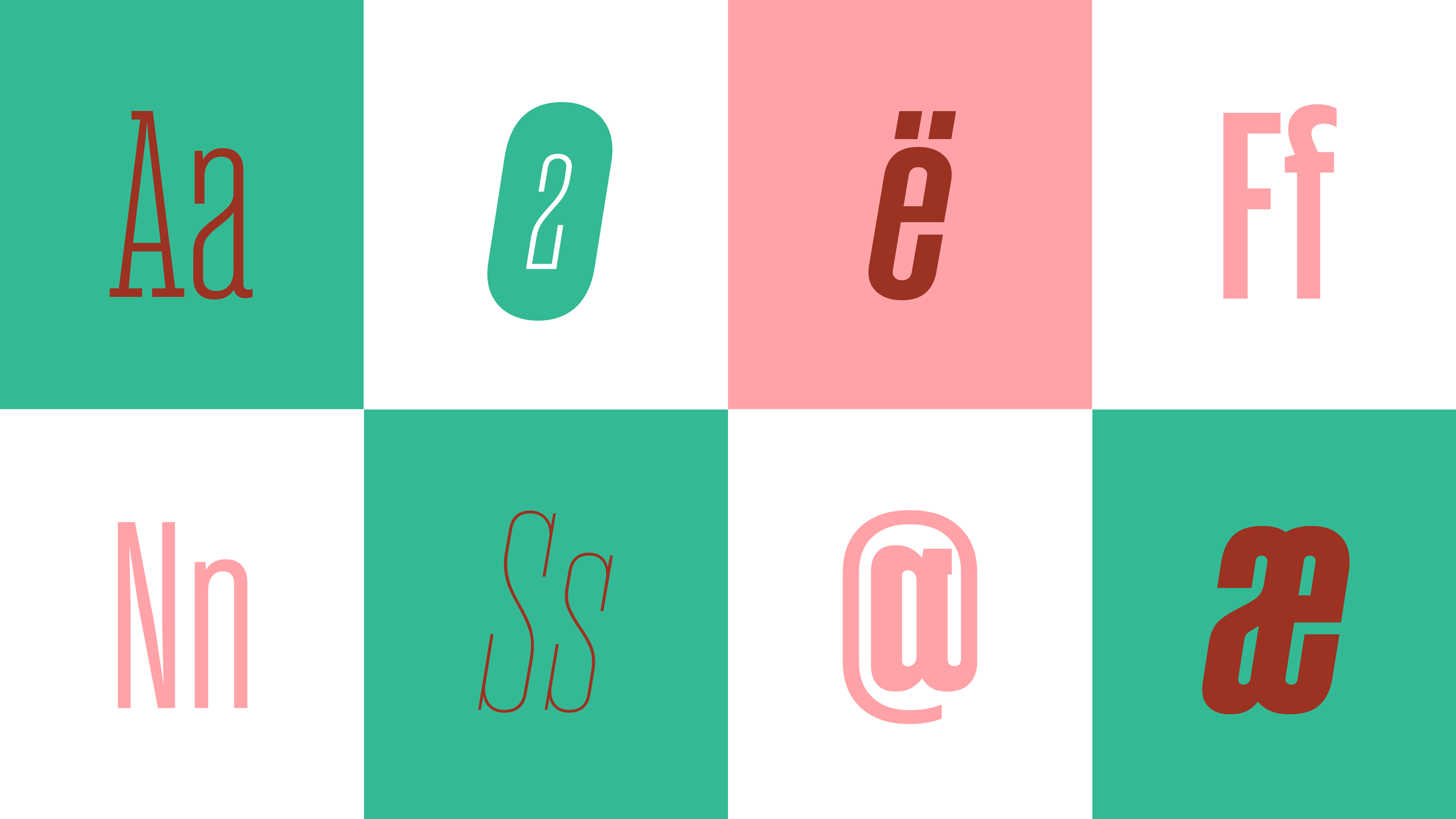
Serif version includes alternates for one storey /g, /Z with a central stroke, cursive forms of lowercase /l and ampersand (many times considered the italic shape, closer to a cursive /E design), /C /G /S /a /c /s /? and /§ with no serifs (in Serif) and, in the opposite way, versions with serifs for figures /2 /3 /6 and /9. It also includes a unicase Stylistic Set, including lowercase /a /e /g and /u shapes in uppercase and small caps.
In the Sans, some alternates that had a direct relation to the design of serifs were cut out, but others (one storey /g, ampersand and unicases) are available in roman and oblique.
This project’s process is deeply explained in this article I wrote, in English and Portuguese.
A type family with a mysterius origin story.
Available for licensing and Adobe Fonts.